What to Look For in Website Design for Small Business Services
A small business website has a hard job. It has to build trust fast, explain a service clearly, answer doubts before they turn into hesitation, and make it easy for someone to take the next step. That is true whether you run a law office, roofing company, med spa, HVAC service, accounting firm, dog grooming business, or local landscaping crew. The design is not there to win awards. It is there to help a stranger feel confident enough to call, book, or request a quote.
That distinction matters more than most owners realize. I have seen plenty of attractive sites that underperform because they are vague, cluttered, slow, or written like they were made for the owner instead of the customer. I have also seen simple sites outperform flashy ones because they answered the right questions in the right order. Good web design is not decoration. It is sales support, customer service, and brand positioning rolled into one.
When people talk about website design for small business, they often focus on colors, logos, and whether the homepage “looks modern.” Those things matter, but they are only the visible layer. The better question is this: does the site make it easy for the right customer to trust you and act?
Start with clarity, not creativity
If a visitor lands on your homepage and cannot tell what you do within a few seconds, the design has already failed. This happens all the time. A site opens with a giant stock photo, a clever slogan, and vague copy about excellence, innovation, or personalized solutions. None of that tells a busy person whether you can solve their problem.
A strong service business website leads with plain, direct language. It says what the business does, who it serves, and where it operates. A plumber should not hide behind abstract branding. A family law attorney should not sound like a lifestyle magazine. A cleaning company should not make people hunt to figure out whether you handle homes, offices, or short term rentals.
Clarity does not mean sounding generic. It means removing friction. If you are a pest control company serving Montgomery County, say that. If you are a bookkeeping firm helping contractors clean up messy books, say that. If your market is local and competitive, details such as service area, response time, and specialties matter more than clever taglines.
This is one reason local relevance matters in web design. If someone is specifically searching for web design the woodlands, they are usually not looking for abstract design theory. They want a site that speaks to local customers, ranks in local searches, and reflects the expectations of that market. Service businesses live or die by fit and trust, and both of those are highly contextual.
The homepage should answer the silent questions
Visitors arrive with unspoken concerns. Can you do the job? Have you done it before? Do you serve my area? Are you expensive? Are you legitimate? Will you call me back? Can I trust you in my home, with my money, or with a sensitive issue?
The best homepages answer those questions without forcing people to dig. That usually means a strong headline, a short supporting statement, a visible call to action, and immediate proof that the company is real. Proof can take several forms, including years in business, reviews, certifications, before and after photos, recognizable clients, or a clear process.
A surprising number of small business sites bury their phone number, hide their contact form, or make the user click through three pages before learning basic facts. That is backwards. Service buyers are often in decision mode, not research mode. They want reassurance, not a scavenger hunt.
I once reviewed a local home service site that had beautiful visuals and elegant typography, but no visible service area on the homepage and no clear list of what jobs the company actually took. The owner complained that leads were poor quality. That made sense. The site was attracting curiosity clicks, not qualified inquiries. After simplifying the copy, adding location language, and making the call to action more explicit, lead quality improved. Not because the site became prettier, but because it became more honest and useful.
Trust signals are not optional
For small business services, design has to carry credibility. Visitors cannot inspect your operation in person, so they rely on what they see on the screen. This is where many businesses either overdo it or underdo it.
Some sites overwhelm people with badges, awards, seals, banners, and popups until the page feels desperate. Others include almost no proof at all, which leaves a visitor wondering if the business is new, untested, or simply careless. The right balance depends on the industry, but every service business should show evidence of reliability.
Reviews matter because they reduce perceived risk. Photos of your team matter because they make the business feel accountable. Real project photos matter because they prove you have done the work, not just described it. A well written about page matters because people hire people, even when they think they are hiring a company.
Trust also shows up in subtler ways. Clean formatting suggests professionalism. Consistent branding suggests stability. Correct spelling and grammar suggest care. Transparent pricing information, even if it is given as a range or a starting point, suggests confidence. Design quality becomes a proxy for business quality, whether that is fair or not.
Navigation should feel effortless
One of the easiest ways to lose leads is to make the site confusing. A service website does not need a complex menu. In fact, complexity usually hurts performance. Most small business visitors are trying to do one of a few things: understand the service, check whether you are a fit, verify credibility, and contact you.
That means your navigation should support those goals. A visitor should be able to move naturally between home, services, about, reviews or portfolio, and contact. If you have many services, organize them in a way that makes sense to a customer, not just to your internal team. For example, a medical clinic might think in terms of treatments and departments, but patients often think in symptoms, outcomes, or appointment types. A construction company might organize by trade, but homeowners think in projects such as kitchen remodels, additions, and outdoor living.
There is also a mobile reality to consider. On many small business sites, more than half of traffic comes from phones. If the mobile menu is clunky, the buttons are tiny, the text is cramped, or the phone number is not tap to call, you are creating friction where people are most likely to bounce. Good web design respects thumbs, short attention spans, and imperfect internet connections.
Speed shapes first impressions more than style
People notice slowness before they notice design nuance. A page that takes too long to load signals inefficiency, especially for local service businesses where urgency is part of the buying decision. If someone has an AC outage in summer or a plumbing leak under the sink, they are not waiting around for oversized images and bloated animations.
Speed problems usually come from common mistakes: giant image files, too many plugins, unnecessary scripts, autoplay video, and effects added because they look impressive in a demo. Those choices often hurt the very thing the site is meant to improve.
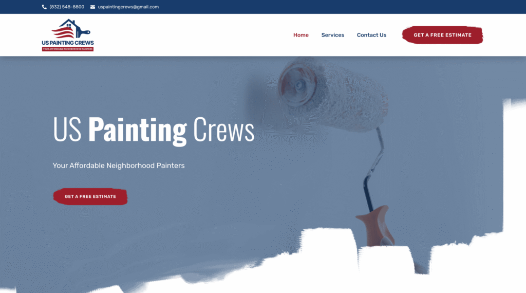
A fast website feels competent. It gets out of the way and lets the customer decide. That does not mean the design should be bare or ugly. It means every visual element should earn its place. Smooth and simple often beats elaborate and sluggish.
This is especially important for businesses investing in SEO or paid traffic. If you pay for clicks and then send people to a slow, confusing page, you are burning budget. Performance is not a technical side issue. It is part of conversion.
Service pages should do real selling
Many small business websites treat service pages like filler. They put a short paragraph under each service and call it done. That is a missed opportunity. Service pages are often where buying decisions happen, especially for search visitors who land directly on them.
A strong service page should explain what is included, who the service is for, what problems it solves, what makes your approach different, and what happens next. It should also anticipate objections. If pricing varies, explain why. If project timelines depend on scope, say so. If customers commonly confuse one service with another, clear that up.
Specificity wins here. Compare “We offer professional lawn care solutions tailored to your needs” with “Weekly lawn maintenance includes mowing, edging, blowing hard surfaces, and seasonal attention to turf health.” The second version does real work. It helps a buyer understand the service, compare providers, and picture the result.
For website design for small business, this level of detail also helps search visibility. Search engines tend to reward pages that thoroughly match user intent. That does not mean stuffing keywords. It means genuinely covering the topic a prospect is searching for.
Calls to action should match buying readiness
Not every visitor is ready to buy on the spot. Some want to call immediately. Some want to compare providers. Some want a quote. Some want to ask a simple question first. A smart site gives people more than one reasonable path forward without creating decision overload.
Here is a practical benchmark for service websites:
- A visible phone number for people ready to talk
- A short form for quotes or consultations
- Clear prompts near key content sections
- A contact page that feels simple, not intimidating
- Reassurance about response time
This is one of the few places where a short list helps because the essentials are easy to miss during a redesign. The point is not to add every possible conversion feature. It is to give the prospect a next step that fits their level of readiness.
I usually advise against long, demanding forms unless the lead needs qualification for scheduling or project scoping. Every extra field lowers completion rates. If you truly need more information, ask for it after the first contact. There are exceptions, of course. A commercial contractor bidding large projects needs different intake than a local dog trainer. The form should fit the sales process, not the other way around.
Real images outperform generic polish
Stock photography is one of the quickest ways to make a small business feel interchangeable. There are cases where stock images can fill a gap, but relying on them too heavily weakens trust. Visitors can tell when the smiling technician in the hero image has never set foot in your office, much less in the service van.
Real photography does not have to be expensive editorial work. Clear photos of your team, your trucks, your workspace, your completed jobs, and your process often do more than glossy stock ever could. They prove you exist in the real world. They also create continuity when a customer later sees your sign, office, or crew in person.
For some industries, before and after visuals can do heavy lifting. For others, the better proof is a clean team photo, a founder portrait, or images of the environment customers will encounter. The visual strategy should reflect the business model. A CPA firm needs different imagery than a fencing company. Good design is never one size fits all.
Local businesses need local signals
A service company that depends on website design for small business a geographic market needs to show it clearly throughout the site. That includes city names, neighborhoods, service areas, local landmarks where appropriate, and references that make the business feel grounded in place. This is useful for users and often helpful for local SEO.
That does not mean awkward keyword stuffing. A page that repeats web design the woodlands ten times will not sound credible to anyone. But if you are a local provider, it makes sense to mention the areas you serve, include case studies from nearby clients, and create service area pages where there is real content to support them.
I have seen small businesses hire large agencies that produce sleek, generic websites with almost no local texture. The site could belong to a firm in Texas, Ohio, or Arizona. That can be a problem. Local service buying is personal. People want signs that you understand their market, their expectations, and in some cases their regulations or seasonal conditions. Regional awareness is part of persuasive design.
Content should sound like a business owner, not a brochure
Most service websites suffer from soft, interchangeable copy. The words are filled with claims like quality, excellence, dedication, and customer satisfaction. Those phrases are not wrong, but they are weak on their own. They do not differentiate. Every competitor says the same thing.
Better copy sounds grounded. It mentions real concerns, common project types, local realities, and how the company actually works. It avoids exaggeration. It explains things in plain language. It gives customers enough detail to feel informed without drowning them in jargon.
This is where experienced web design makes a big difference. Design and copy cannot be separated. Beautiful layout cannot rescue vague messaging, and great copy can be wasted by poor layout. The best sites combine both so that the right words appear at the right moment, in the right order, with the right visual support.
A good example is the handling of pricing. Some owners hide it completely because they fear scaring people off. Sometimes that is reasonable, especially when every project is customized. But a total lack of pricing context can cause the wrong leads to flood in, while qualified prospects hesitate because they assume the service is out of reach. Often the middle ground works best: starting prices, package ranges, or a short explanation of what affects cost.
Pay attention to the details that quietly kill trust
Customers notice more than owners think. An outdated copyright year, broken links, a contact form that fails, blurry logos, inconsistent fonts, and missing basic information all chip away at confidence. None of these issues seems dramatic on its own, but together they create doubt.
The same goes for accessibility and readability. Tiny text, poor color contrast, and wall to wall jargon make a site feel hostile. Not every small business needs a technically perfect enterprise grade build, but every site should be easy to read and usable by normal people in normal conditions. That includes older visitors, distracted visitors, and people checking your site quickly from a phone in a parking lot.
When reviewing a website, I like to imagine a customer who has never heard of the business before, has five minutes at most, and a mild reason to be skeptical. What on the page would lower that skepticism, and what would reinforce it? That framing catches issues owners miss because they are too close to the business.
Ask practical questions before you hire a designer
Not all designers understand service businesses. Some are excellent at aesthetics but weak on messaging, conversion, and local search. Others rely on templates that look fine at launch but create maintenance problems later. The portfolio may be attractive, yet the business results may be unclear.
Before you invest, ask questions that reveal how the provider thinks:
- How do you structure a homepage for a local service business?
- What do you need from us to write or shape effective service pages?
- How do you handle mobile performance and page speed?
- Will the site be easy for us to update after launch?
- How do you approach local SEO basics during the build?
The answers should sound practical, not vague. If someone talks only about trends, visual inspiration, or aesthetics, keep pressing. A small business site is not an art project. It is a working asset that should support revenue.
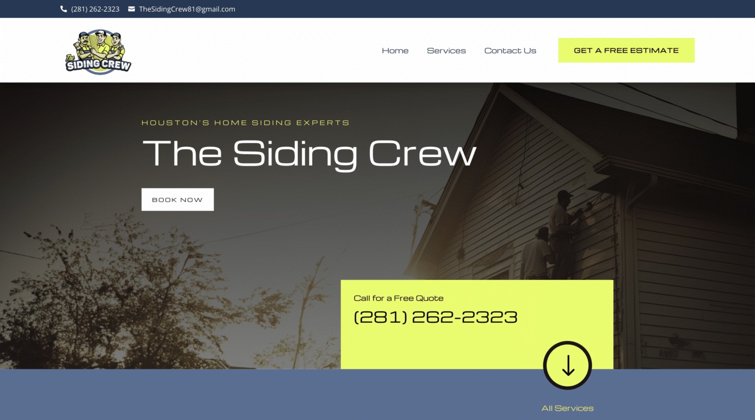
This is especially true if you are evaluating providers for web design the woodlands or any other local market where competition is strong and buyers compare several companies quickly. You want a partner who understands how local prospects behave, what content they look for, and how design decisions affect calls, forms, and rankings.
The best website feels obvious to the customer
When a site is doing its job well, it rarely gets complimented for being clever. Customers simply move through it with ease. They understand what the company offers. They feel reassured. They find the proof they need. They know how to act. That sense of ease is the outcome to chase.
For a small business owner, that usually means resisting the temptation to overbuild. You do not need endless animations, trendy layouts, or pages that exist only because a template included them. You need a website that reflects your actual business, speaks clearly to your actual customers, and removes doubt at every step.
That is what effective website design for small business really comes down to. Not whether it looks expensive, but whether it feels trustworthy, useful, and easy to act on. If your site can do that consistently, it becomes more than an online brochure. It becomes one of the most reliable people on your sales team.
Scalable Websites
Website design for contractors and small businesses
Based in Montgomery, TX, serving Montgomery County and greater Houston
Phone: (832) 979-2478
Website: scalablewebsites.com
Hours: Monday to Friday, 8 AM to 5 PM
Scalable Websites builds and manages mobile-first websites for contractors and small businesses on simple monthly plans, with hosting, security and unlimited updates included. Find us on Google.